Rebranding RFA: Identity, Culture and Digital Transformation
Directed Radio Free Asia’s rebranding campaign, creating a flexible logo system, redesigning websites across 11 services and 16 languages and training multilingual teams through a CMS migration. The project balanced cultural nuance, technical constraints and organizational legacy to deliver a cohesive, modern brand identity.
Behind the Story
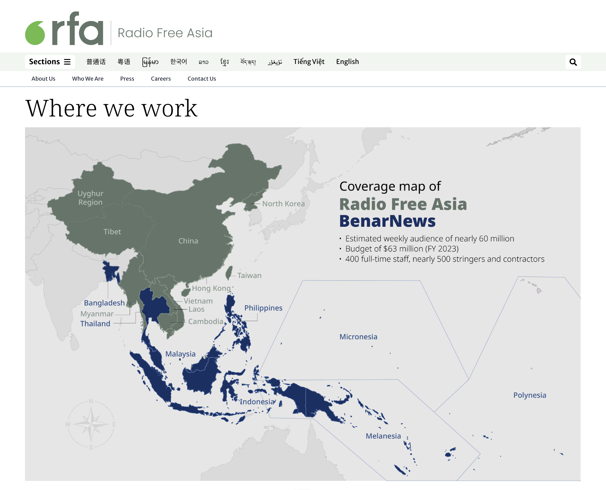
When Radio Free Asia began its rebranding initiative, the challenge was clear: build a modern, unified brand identity that could serve audiences across 11 services, 16 languages and multiple platforms — all without losing the legacy and trust the organization had earned.
The goals were ambitious:
Create a new logo system adaptable across all services.
Redesign the websites, ensuring accessibility, multilingual support and cultural nuance.
Build a scalable visual system that would work across future CMS migrations.
Train over 100 staff across multiple countries to apply and sustain the system.
Challenges
The old system was fragmented. Each language service had its own look, navigation and branding, making the organization appear disconnected. Some design elements hadn’t evolved in years. And the new system had to support global linguistic diversity at its core.
The greatest challenge, however, was organizational. A newsroom of journalists across Asia and Washington, D.C., each with their own culture and habits, had to feel that the new identity reflected their voice. Creative disagreements were inevitable, but essential to building something that truly belonged to everyone.
The Process
We began with the logo. The new design honored RFA’s legacy but refined it into a more flexible, contemporary mark. From there, we created a modular visual system — typography, color palettes, templates — that could stretch across 16 languages without losing consistency.
We redesigned the websites, introducing cleaner UX/UI patterns, multilingual navigation, and templates optimized for digital-first storytelling. Special care went into right-to-left readability, cross-platform performance, and scalable code.
We also ran hands-on training workshops for each service, ensuring that journalists and editors could apply the system confidently. Training wasn’t just about design — it was about helping teams understand how branding and storytelling intersect, and why a shared identity matters.
The Outcome
The final system launched across all services, surviving a CMS migration and evolving newsroom needs. For the first time, RFA presented itself as a cohesive, modern news organization — a brand that respected its past while positioning itself for the digital future. And the web redesign increased user engagement by nearly 40 percent. (The average time spent with a story immediately went from 21 seconds to 29 seconds - a 38 percent increase)

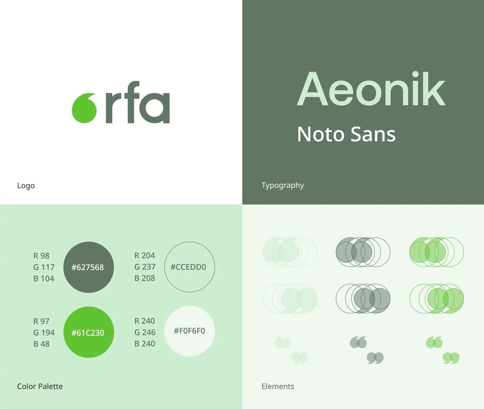
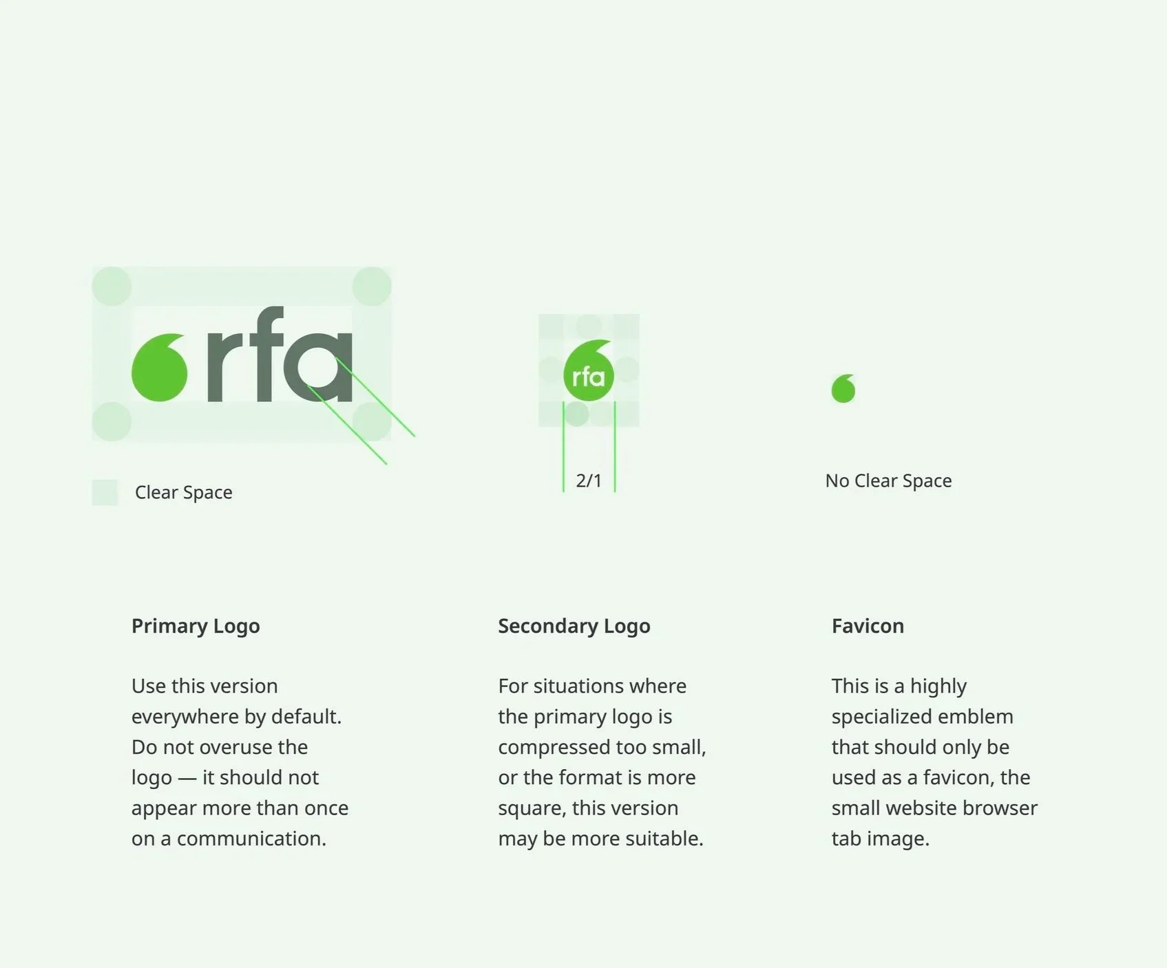
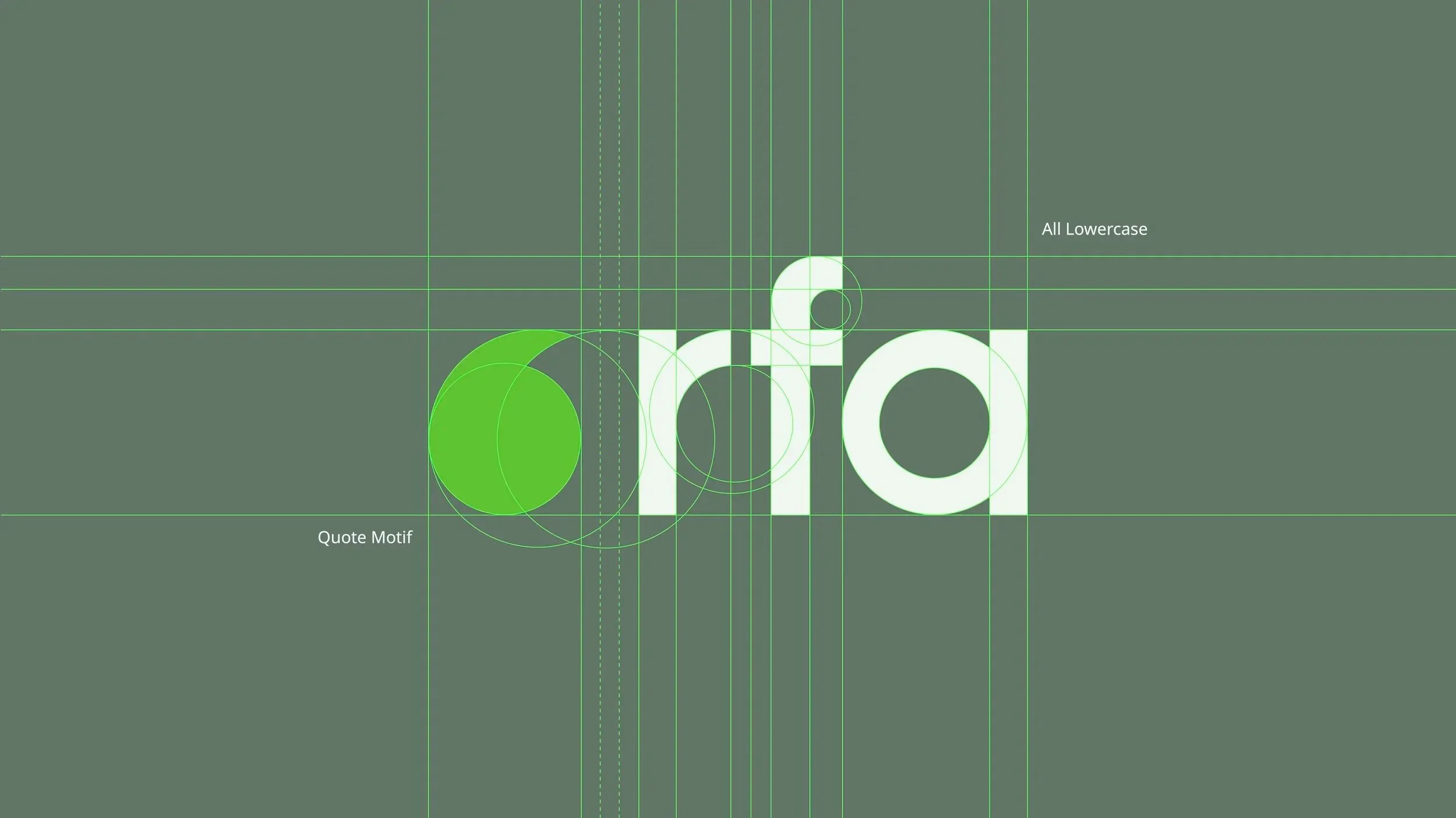
The logo carries on the green color from the original design, and is meant to be clean and highly legible.
Lowercase Lettering
We use lowercase letters to instill a sense of friendliness, and is aided by the roundness of the lettering (as opposed to capital letters). The lettering is hand-drawn and unique.
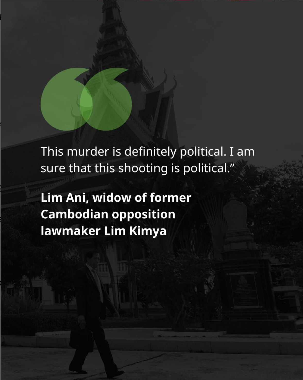
Quote Emblem
We use a single quote expression to represent speech, communication, expression, and dialogue.


Creating a new logo system
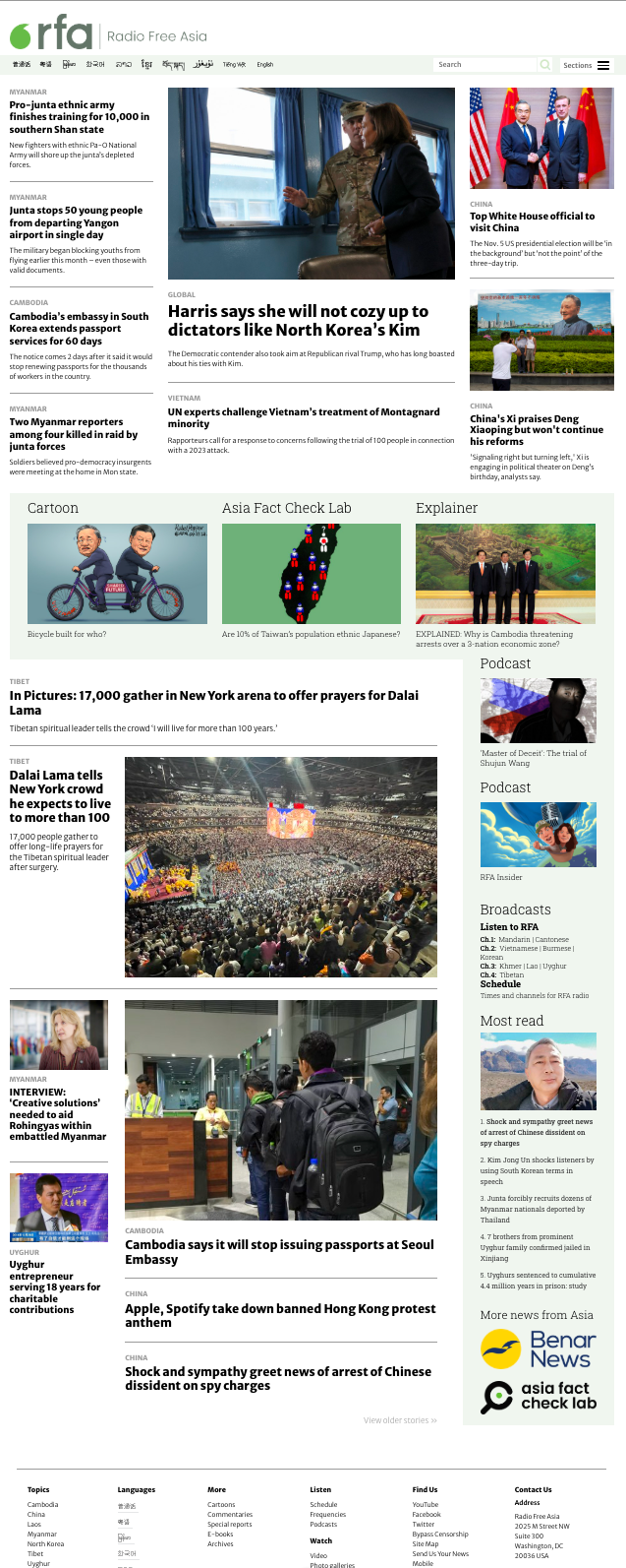
The legacy interface supported publishing well, but relied on a simple chronological flow. Without clear visual hierarchy, it was difficult to highlight priority stories or multimedia content in ways that matched modern audience habits.


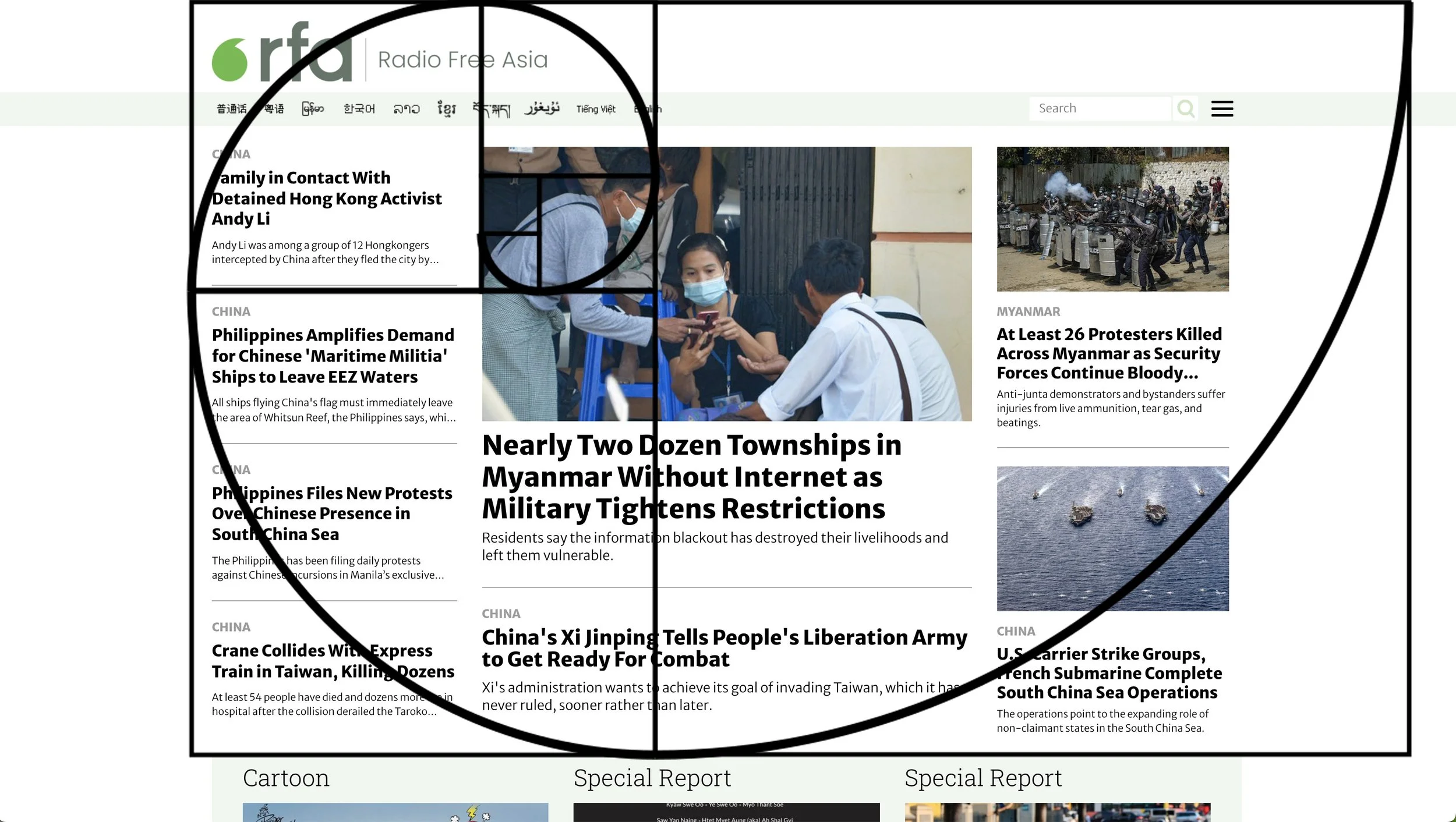
The new design is grounded in the Golden Ratio, aligning layout with the natural path of the human eye. Visual hierarchy was introduced throughout the page, ensuring priority stories, features, and multimedia stand out while content continues to flow chronologically below. Redesign increased user engagement by nearly 40 percent.
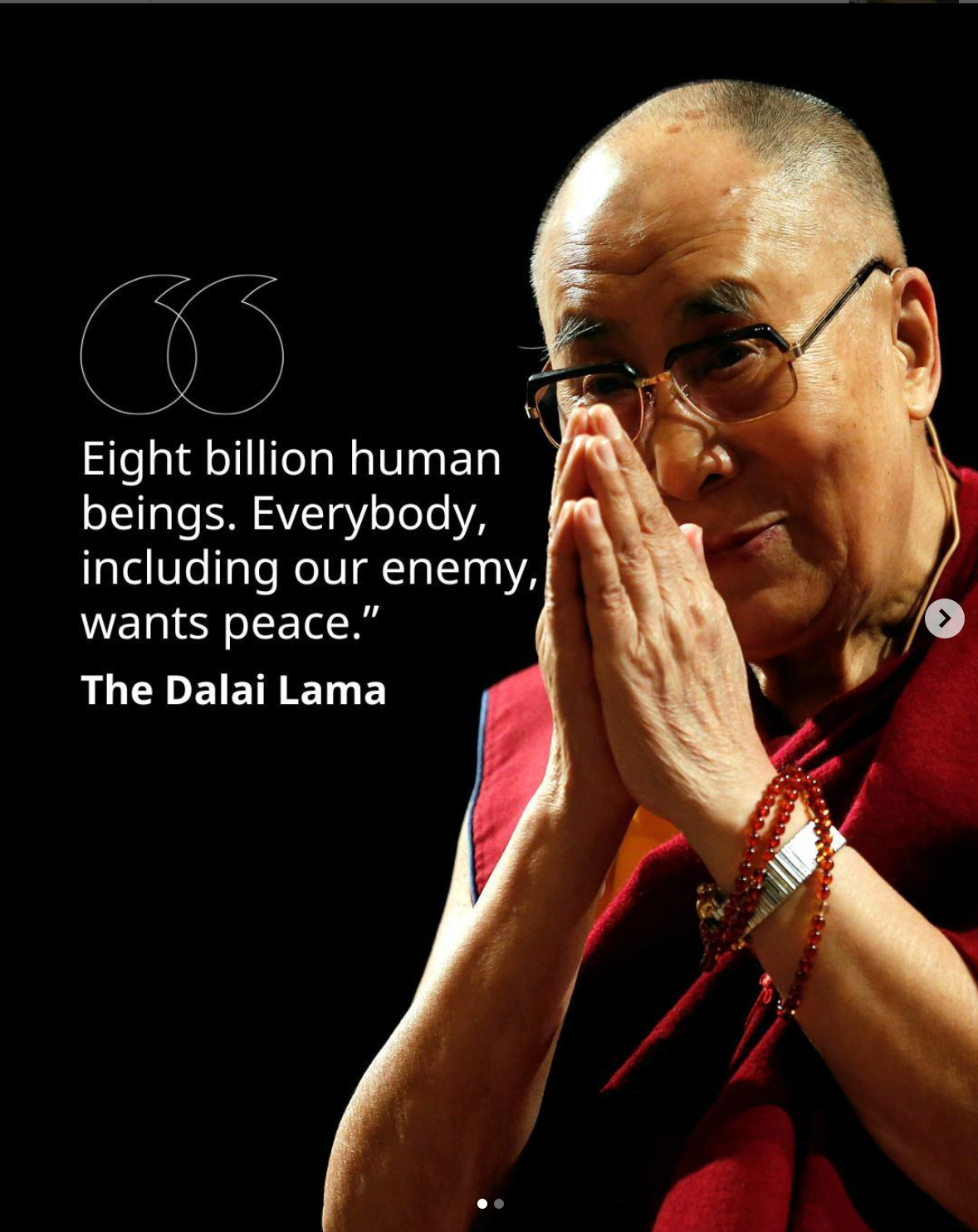
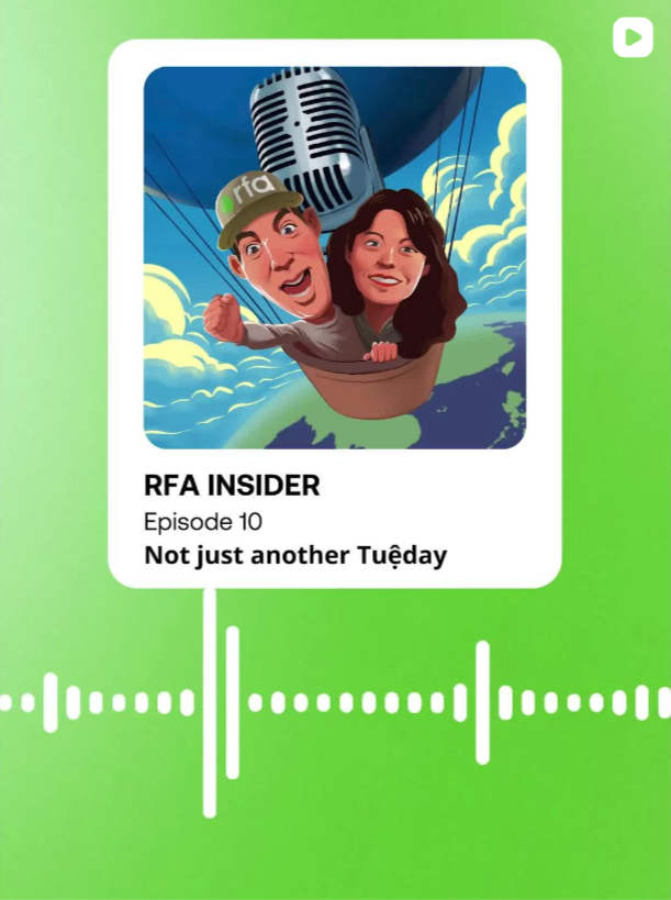
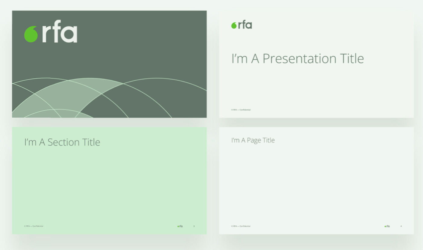
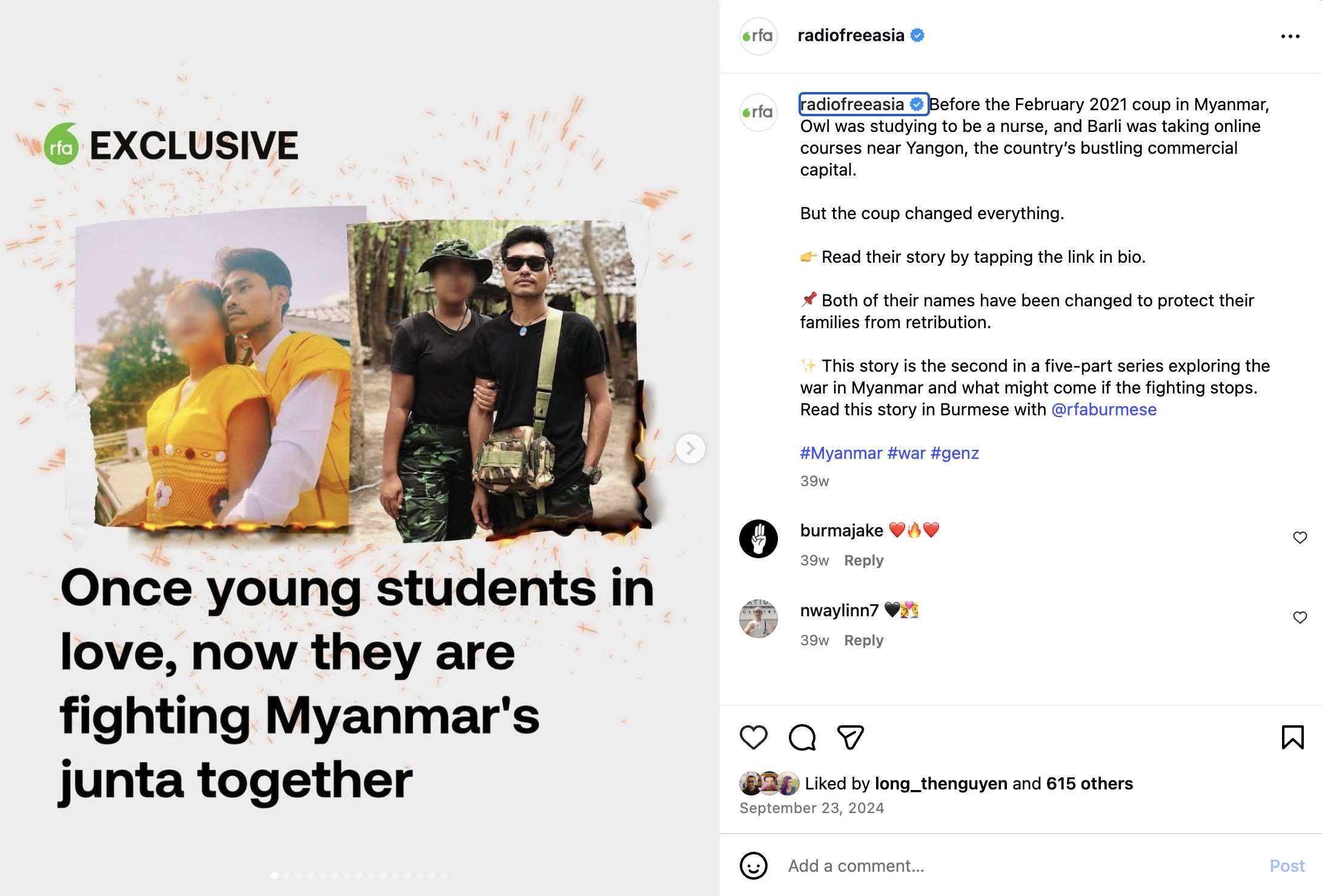
Examples of the system in practice.